

In this article we will show you how to edit pie chart in excel, Microsoft Excel is an import document for data keeping and using the data for different official purposes. The data stored in an excel sheet can be extracted to form pie charts, histograms and many other graphs and comparisons can be drawn from it.
A pie chart is basically a visual representation of data that displays the amount of several categories with respect to the total value.
Creating a pie chart on excel is a comparatively easy task. But once its created, you have to edit it for different purposes. So we will discuss the steps of editing a pie chart in this article.
Step By Step Guide On How To Edit Pie Chart In Excel :-
Edit the default pie chart title
There are instances where you have to edit the default chart title to add a more suitable one. So let's see how to you can do it:
- Select the default chart title. Once you do, a box appears around it.
- Click on the text so that Excel goes into edit mode.
-
Place the cursor inside the title of the box.

- Press either delete or backspace to remove the default title.
- Type the desired chart title that you want to add.
- If you wish to separate your title in 2 lines then place the cursor between 2 words.
- Press enter. You will see that the title is now in two lines.
Edit the chart to add data labels
Adding data labels to a chart can get confusing for some people. There are instances where the wrong part is selected and the entire chart gets messed up. You can then use the undo feature of excel and start again. Let us see the step to add data labels on pie charts:
- Properly select the plot area of the pie chart.
-
Right click on the chart.
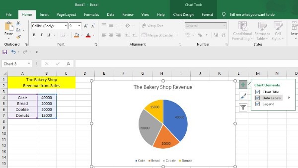
- Click on add data labels.
- Add the data labels you wish to enter.
Edit the pie chart to change colors
- Select an area in the pie chart background to select the entire chart.
- Next go to chart tool design to change the color of the pie chart.
-
Select change colors.
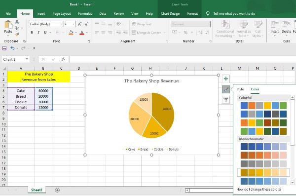
- To get the preview of colors in the pie chart, hover over a range of colors.
- Choose the color you want to add to the pie chart.
- To change the background color, go to the chart tools format tab.
- Select shape fill.
- Choose a color that you want to add.
- If you want to add a gradient to the background, then select shape fill.
- Select Gradient to add it to your pie chart.
- Choose a gradient style.
- Select the text fill drop down arrow to change the color of the title text.
- Choose a color you want.
Conclusion :-
If you follow all the above-mentioned steps, you can easily edit your pie chart in different ways. The steps are easy to follow and you can use it to make your presentation more attractive.
It will impress your audience and leave a positive impression on them. So follow the steps to efficiently edit your pie chart and I hope this article on how to edit pie chart in excel helps you.